From Fire Truck to Blending Beauty: The Evolution of Our Big Red Truck

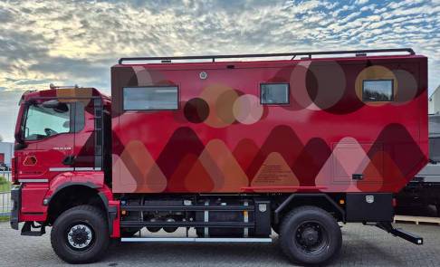
Let’s talk about our beloved truck’s bold red color — a shade that’s impossible to miss at any campsite. It’s a beacon, making it easy for everyone to find us. “Oh, the big red truck!” That’s us.
Why red, you ask? Most expedition vehicles of this size lean toward military tones like gray or olive green. But from the start, we wanted to avoid any associations with a military look. While Annika loves the “fire truck” comparisons (better to be linked with rescue than destruction, right?), I find it … a bit tiresome.
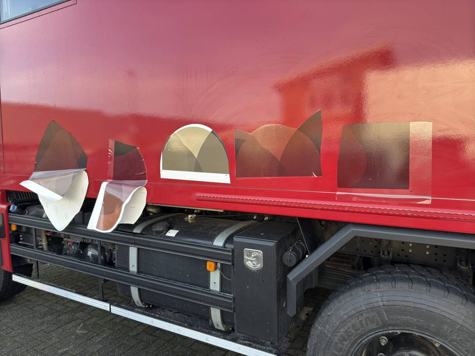
Still, the red served us well during our maiden voyage to Nordkap. We didn’t want to delay our travels to perfect the look, so we embraced the fire truck aesthetic. But now, it’s time to take our design up a notch — introducing our custom foil wrap!
The Design Philosophy
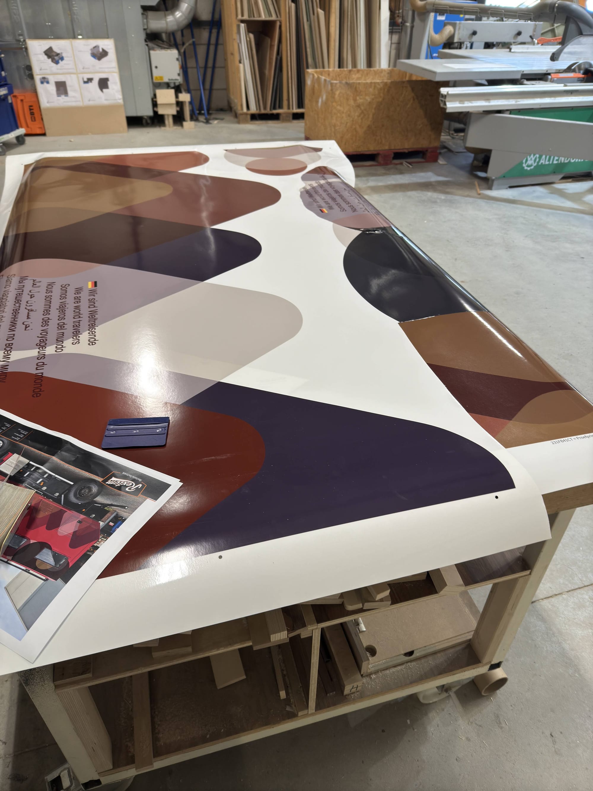
We wanted a look that feels at home in nature yet maintains our unique identity. Inspired by our travel.fo-mo logo, we’ve incorporated the circle and triangle into the design:
- Triangles create subtle mountain and hill shapes along the lower section of the truck.
- Circles form cloud-like patterns near the top.
- Dark accents frame the edges to soften the boxy silhouette when viewed from a distance.
The result? A harmonious blend of earthy gray, brown, and yellow tones — think camouflage, but not military. Surprisingly, even the dark red we’re keeping as a base blends beautifully with natural landscapes, especially in dark hours.
Why Now?
During a recent stop at Twiga (the firm behind our truck build), we met with the subcontractor to test and finalize the design. With the foiling scheduled before February, we’re one step closer to completing this puzzle piece of our overlanding rig.

We can’t wait to see the finished result — and to leave the “fire truck” nickname behind.

For now, here’s a sneak peek at some mock-up of the design. What do you think of the transformation?
Stay tuned for the big reveal!
